Widget Builder Playground
The Widget Builder Playground is a visual, no-code way to configure the ZipTier embed widget and generate the exact <script> tag to paste onto your website. Adjust every attribute in real time, preview the button and chat window on a simulated device, and copy a ready-to-use snippet when you're happy.
It exists so you don't have to memorize the Widget Customization Reference or edit and reload HTML repeatedly. Everything you can do with data-* attributes on the script tag, you can do here through form controls.
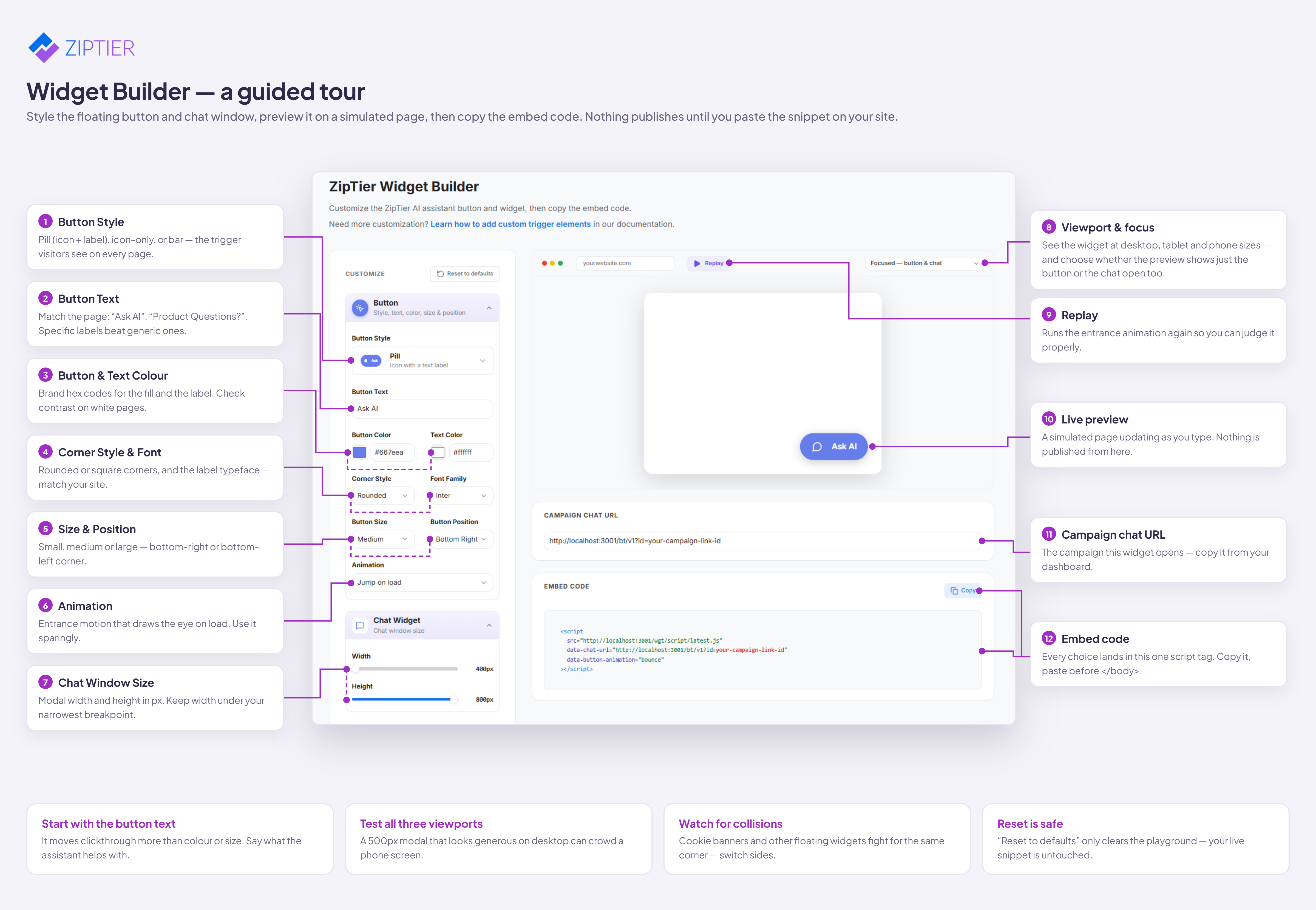
Click the screenshot above to open it in a new tab at full resolution.
Open the playground → https://www.ziptier.ai/widget-builder
Getting Started
- Open the Widget Builder Playground in a new tab.
- Paste your campaign chat URL into the
data-chat-urlfield at the top of the Customize panel. You'll find this URL on your campaign confirmation screen or the campaign dashboard. Until you fill this in, the Copy Code button will warn that your snippet is incomplete. - Configure the button and widget appearance using the controls in the Customize panel on the left. The Preview panel on the right updates instantly.
- When the preview looks right, click Copy Code. Paste the resulting
<script>tag onto your website just before the closing</body>tag (see Platform Install Guides for WordPress, Shopify, Webflow, Squarespace, and Next.js).
Configure the Launcher Button
Button Style
The Button Style picker shows the four launcher variants with a mini preview of each, so you can see them before you commit:
- Pill — rounded button with chat icon + label (default). Best for most sites.
- FAB — round floating action button, icon only. Minimal footprint.
- Avatar — white card with an agent avatar and name. Best for high-touch sales/support.
- Textbox — search-bar style; visitors can type a question first, and it's auto-sent as the opening message. Best for product pages.
Text, Font & Corner Style
- Button text — the label on pill/avatar launchers, the placeholder on textbox launchers, or the tooltip on the FAB. Use context- specific copy like "Get Help", "Ask about pricing", or "Product Questions."
- Font family — pick a common font (Inter, Roboto, Poppins) or let it inherit the system stack.
- Corner style —
roundedorsharpcorners for pill, avatar, and textbox styles.
Colors
Use the color pickers or paste a hex value. Two colors control the button:
- Button color — the background of the launcher.
- Text / icon color — the foreground color used for the label and icon.
Tip: match the button color to a brand accent that's visible on your site but not identical to your primary CTA — you want visitors to notice the launcher without confusing it with your existing buttons.
Size & Position
- Button size —
small,medium, orlarge. Small suits dense product pages; large is easier to notice on content-heavy pages. - Button position —
bottom-right(default),bottom-left, orbottom-center. Choose the corner that doesn't collide with your existing floating elements (cookie banner, other widgets). - Widget width & height — the chat panel itself. Width
400px–600px, height400px–800px. Wider panels give more room to read long AI answers.
Style-Specific Controls
- Avatar style only — set the initials shown inside the avatar circle (up to 3 chars) and their color. Handy for personifying the assistant (e.g., "AL" for a persona named Alex).
- Textbox style only — set the background opacity between
0.4and1. Lower opacity blends the launcher into image-heavy hero sections.
Configure Engagement Animation
The Animation control decides how the button announces itself the first time visitors see it:
- None — button just appears in place. Least disruptive.
- Bounce (default) — a subtle vertical bounce that draws the eye.
- Pulse — a soft ripple around the button.
- Teaser — a small chat bubble pops out next to the button with a preview message (set via Greeting text).
- Auto-open — opens the full chat window automatically after a short delay, with the greeting as the first AI message. Falls back to
bounceon mobile viewports to preserve screen space.
Click Replay to trigger the animation again in the preview without waiting for a page reload — useful for comparing bounce vs. pulse vs. teaser side-by-side.
Note: pulse and auto-open aren't available for the textbox style. If you switch to textbox, the playground automatically hides those options.
Preview Across Devices
The Preview panel simulates how the widget looks on a real webpage. Use the viewport selector above the preview to switch between presets:
- Focus — a zoomed-in preview centered on the launcher and chat window. Best for iterating on colors, text, and animation.
- Desktop — common desktop widths (e.g. 1280×720, 1440×900) to see the widget in context of a full-width page.
- Tablet — iPad-class widths so you can check how the widget behaves on medium screens.
- Phone — small viewports (e.g. 375×667) that trigger the same mobile fallbacks visitors will see (auto-open reverts to bounce; the chat window caps its width).
Click the launcher in the preview to open the chat window and see how the header, greeting, and disabled input look. Click it again (or the close button) to collapse it back down.
Copy the Embed Code
Once the preview looks right:
- Make sure the
data-chat-urlfield is filled in with your real campaign chat URL — otherwise you'll get a warning and the copied snippet won't connect to your campaign. - Click Copy Code. The button confirms the copy with a checkmark.
- Paste the snippet into your site's HTML, just before the closing
</body>tag. Platform-specific instructions live in the Platform Install Guides.
The generated snippet contains only the attributes you actually changed — everything left at its default is omitted, so the code stays as short as possible.
Iterating After You Ship
You don't need to re-embed the widget every time you change its look. To adjust an existing installation:
- Open the playground and reconfigure the widget the way you want it.
- Copy the new snippet.
- Replace the old
<script>tag on your site with the new one. Thesrcstays the same; only thedata-*attributes change.
To wipe your configuration and start from scratch, click Reset to defaults in the Customize panel header. Only the widget style is reset — your typed data-chat-url stays.
Tips
- Preview on phone before shipping. Some animations (auto-open) behave differently on small screens. Switch the viewport to phone before you copy.
- Prefer short button labels. On the pill and avatar styles, long labels wrap awkwardly. Aim for 2–3 words ("Ask AI", "Get Answers", "Book a Demo").
- Use the teaser animation for pricing/contact pages. The teaser message is a low-friction nudge that gets clicked more than a silent button.
- Match position to your existing floating UI. If you already have a cookie banner or intercom-style bubble in the bottom-right, move the ZipTier launcher to
bottom-leftorbottom-center.
Prefer to hand-edit the <script> tag directly? Every setting in the playground maps 1:1 to a data-* attribute documented in the Widget Customization Reference.