Custom Trigger Elements
Beyond the standalone page and the built-in embed widget, you can mark any element on your website as a trigger to open the main widget. This lets you repurpose existing buttons, cards, or styled sections as gateway points into the chat without building them from scratch.
How It Works
Add the ziptier-widget-trigger class to any element on your page. When clicked, it opens the same site-wide widget instance. Optionally, add data-trigger-question to prefill a message.
Note: Custom triggers use plain HTML classes and attributes, not a JS framework, so they work the same on WordPress, Shopify, Webflow, Squarespace, or any hand-coded page. They require the main embed widget script to also be present on the page — see Website Embed for the base install.
Basic Trigger (Unstyled)
The simplest form — wrap your own HTML and CSS:
<button class="ziptier-widget-trigger">
  Ask our AI
</button>
Because the class alone is enough, any existing element on your page can become a trigger — no markup changes beyond adding the class. Add data-trigger-question and it also prefills the widget's input when clicked:
<div class="help-section">
  <h3>Have Questions?</h3>
  <p>Our AI assistant can help.</p>
  <button class="ziptier-widget-trigger"
          data-trigger-question="What's included in your support plan?">
    Ask now
  </button>
</div>
The most effective implementations don't stop at one generic question — they route visitors straight to the answer they're actually looking for. Here's Acme Corporation, an industrial supplier, using a card of Basic triggers like the one above — each pre-loaded with a question specific to what a visitor on that page would want to know — next to one free-form fallback trigger for anything else:
Below is Acme Corporation's page-specific trigger flow, showing a clicked trigger question landing directly in the AI Assistant's chat input.
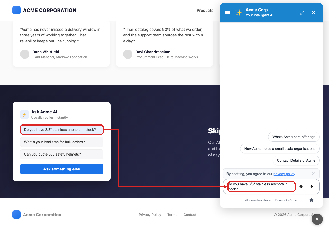
Each pill above is just a styled button with its own ziptier-widget-trigger class and data-trigger-question, e.g. data-trigger-question="Do you have 3/8" stainless anchors in stock?". The "Ask something else" button is a plain trigger with no prefilled question at all.
Styling a Trigger Yourself
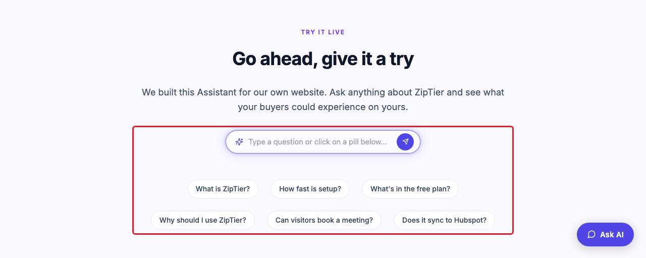
There is no auto-styled option — a trigger is always your own markup and CSS. This is exactly how our own homepage's "Try it live" textbox works: it's a hand-built input and send button, wrapped in an element carrying the ziptier-widget-trigger class, that sets data-trigger-question to whatever the visitor typed right before it opens the widget.
Below is the "Try it live" trigger on ZipTier's own homepage, a custom-styled search box with suggestion pills beneath it.
Example: A Search-Box Style Trigger
Basic skeleton for a textbox trigger like the one above — style it to match your site:
<div class="zt-ask-box ziptier-widget-trigger"
     data-trigger-question="What does ZipTier cost?">
  <span class="zt-ask-icon">✨</span>
  <span class="zt-ask-placeholder">Type a question or click on a pill below...</span>
  <button type="button" class="zt-ask-send">➤</button>
</div>

<style>
  .zt-ask-box {
    display: flex;
    align-items: center;
    gap: 10px;
    padding: 10px 8px 10px 18px;
    border-radius: 9999px;
    background: #fff;
    border: 1px solid #d9d4f7;
    box-shadow: 0 0 0 4px rgba(99, 91, 255, 0.08);
    cursor: pointer;
  }
  .zt-ask-placeholder {
    flex: 1;
    color: #9a9aa5;
  }
  .zt-ask-send {
    display: flex;
    align-items: center;
    justify-content: center;
    width: 32px;
    height: 32px;
    border: none;
    border-radius: 50%;
    background: #635bff;
    color: #fff;
    cursor: pointer;
  }
</style>
Any Element Works, Including Links
The class isn't limited to buttons or divs — put it on an existing link and it becomes a trigger too. If the link has a real href, prevent its default navigation so the click opens the widget instead of following the link:
<a href="#" class="ziptier-widget-trigger"
   data-trigger-question="What does ZipTier cost?"
   onclick="event.preventDefault()">
  Ask about pricing
</a>
Available Attributes
| Attribute | Description | Example |
|---|---|---|
ziptier-widget-trigger | Marks this element as a trigger (required, CSS class not an attribute) | class="ziptier-widget-trigger" |
data-trigger-question | Prefills the widget's input box with this message when it opens; the visitor still has to send it themselves | data-trigger-question="Tell me about pricing" |
data-trigger-autosend | Paired with data-trigger-question — sends that message immediately instead of just prefilling it, e.g. when your own trigger already has its own Send button or Enter-to-send | data-trigger-autosend="true" |
When to Use Custom Triggers
- Product pages: Add launch points next to key features or FAQs.
- Navigation bars: Place a "Contact AI" button alongside standard nav links.
- Landing pages: Embed multiple entry points (e.g., bottom of each section).
- Hero sections: Build a textbox trigger styled to match your design.
- Custom elements: Wire up any existing button or card to open the widget.
The floating launcher's look (pill, fab, avatar, textbox, colors, animation) is styled from campaign settings instead — see the Launcher Design Reference for that style vocabulary, including what each style looks like.