Launcher Design Reference
This is the full reference for the “Ask AI” launcher button — the control a visitor sees on your website before the chat opens. Every setting below lives in Launcher Design, in your campaign's AI Assistant Customization step. For the basic install, see the Website Embed guide.
Your embed code never changes. These settings are stored on the campaign and read by the widget each time a visitor loads your page, so saving Launcher Design updates your live site straight away. You paste the script tag once and never replace it.
Sandbox and production share one set of launcher settings, so what you approve in testing is exactly what goes live.
Launcher button
| Setting | Default | Description | Options |
|---|---|---|---|
| Button Style | Pill | Visual style of the launcher button | Pill, Classic FAB, Agent Avatar, Search Bar |
| Button Text | Ask AI | Label on Pill and Agent Avatar. The field is relabelled Tooltip Text for Classic FAB and Placeholder for Search Bar, since that is what it becomes. | Up to 30 characters |
| Button Color | Your header background | Background color of the button; also tints its glow and icons | Any hex color |
| Text Color | Your header font color | Color of the label and icon on the button | Any hex color |
| Button Size | Medium | Size of the launcher button. Not shown for Search Bar, which sizes to its width instead. | Small, Medium, Large |
| Font Family | Inter | Font for the button label. Not shown for Classic FAB, which has no label. | Inter, Roboto, Open Sans, Poppins, Lato, Nunito, System UI, Georgia |
| Corner Style | Rounded | Corner style for Pill, Agent Avatar and Search Bar | Rounded, Sharp (rectangle) |
| Button Position | Bottom Right | Which corner of the page the launcher sits in. Search Bar defaults to Bottom Center. | Bottom Right, Bottom Center, Bottom Left, Top Right, Top Left |
💡 Colors follow your header. Until you pick a button color of your own, the launcher tracks the header colors you set in Header Design — so branding the assistant brands its button too. The moment you choose a button color yourself, it stops following and stays where you put it.
Launcher Button Styles
| Style | Description | Best for |
|---|---|---|
| Pill | Rounded button with chat icon and label text (default) | Most websites — visible and descriptive |
| Classic FAB | Round floating action button with chat icon only, no label | Minimal footprint; the icon is universally recognized |
| Agent Avatar | White card with an agent avatar circle and name — conveys a human presence | High-touch sales or support experiences |
| Search Bar | Search-bar style with a text input. Visitors can type a question before opening the chat; the message is auto-sent as the first message. | Product pages where users arrive with a specific question |
Style Previews
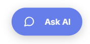
Pill — rounded button with a chat icon and label text. The default; the widest option and the most self-explanatory.
Below is the Pill launcher style, the default rounded button with a chat icon and label text.
Classic FAB — a floating action button showing only the chat icon. The smallest launcher; use it when you want the assistant present but visually quiet.
Below is the Classic FAB launcher style, the small round button showing only the chat icon.

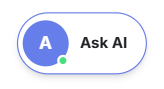
Agent Avatar — a white card with an agent avatar circle and name label. Signals a human-like presence and reads as more high-touch than a plain button.
Below is the Agent Avatar launcher style, a white card with an avatar circle and name label.
Search Bar — a search-bar shaped input with a placeholder. Visitors can type their question directly; the message is auto-sent as the opening line when the chat opens.
Below is the Search Bar launcher style, a search-bar shaped input with a placeholder prompt.

Agent Avatar style only
These two settings appear only when Button Style is Agent Avatar.
| Setting | Default | Description |
|---|---|---|
| Agent Initials | First letter of Button Text | Initials shown inside the avatar circle (up to 3 characters) |
| Agent Initials Color | #ffffff | Color of the initials text inside the avatar circle |
Search Bar style only
These two settings appear only when Button Style is Search Bar.
| Setting | Default | Description | Range |
|---|---|---|---|
| Button Opacity | 1 | How transparent the search bar looks over your page before a visitor focuses it | 0.4–1 |
| Search Bar Width | Auto | Optional fixed width. Leave blank and the bar sizes itself to the viewport. | 240px–900px |
Animation
A quick, one-time nudge on the launcher button itself, shortly after it appears.
| Setting | Default | Description | Options |
|---|---|---|---|
| Animation | Jump on load | An optional nudge that draws attention to the launcher shortly after the page loads | None, Jump on load, Attention pulse + badge |
Note: Attention pulse + badge isn't available for the Search Bar style (its badge has nowhere to anchor), so the dropdown hides it there — use Jump on load or None instead.
Teaser pane
A separate engagement card that appears a few seconds after the launcher, inviting a question. Independent of the animation above — a campaign can run both at once (e.g. Jump on load and bubble text).
| Setting | Default | Description | Options |
|---|---|---|---|
| Teaser Pane | None | Which engagement card appears above the launcher, if any | None, Bubble Text, Chat Snapshot, Avatar-based teaser |
| Teaser Text | 👋 Have a question? Ask me anything — I reply instantly. | Shown in the bubble text, the avatar-based teaser, and as the first message in the Chat Snapshot card. Only appears when Teaser Pane isn't None. | Up to 100 characters |
| Show on launcher | Initials | Avatar-based teaser only: show the Avatar image or the agent initials on the card. Independent of the Agent Avatar button style, which always shows its own initials. | Avatar image, Initials |
Note: Chat Snapshot isn't available for the Search Bar style (no room to preview a chat card there) — use Bubble Text, Avatar-based teaser, or None instead. Every teaser pane option appears 3 seconds after the launcher is ready.
Avatar-based teaser is a richer card: an avatar (photo or initials), the greeting text, up to 2 of your kickoff questions, an input bar, and a Speak now button that opens the chat with voice input already listening. It has its own layout on mobile.
Chat window
The size of the chat panel the launcher opens, on desktop. Phones always open it full-screen, whatever you set here.
| Setting | Default | Range |
|---|---|---|
| Width | 400px | 320px–600px |
| Height | 800px | 400px–900px |
Previewing your changes
The preview panel beside the form shows both halves of what a visitor meets: the chat interface, with the launcher button attached beneath it. Use the Chat preview and Launcher preview toggle to pick which one Play demo plays:
- Chat preview plays the conversation from the greeting message through your lead-capture questions.
- Launcher preview plays the button landing on the page, running its animation, and opening the chat.
Expand opens the launcher over a full device frame, where you can switch between desktop, tablet and phone resolutions — worth checking, since the launcher and chat window both change layout on small screens.
Recipes
Search-bar launcher on a product page
Button Style Search Bar, Placeholder What would you like to know?. Visitors type their question straight into the page and it becomes the opening message.
Named agent for high-touch sales
Button Style Agent Avatar, Button Text Ask Alex, Agent Initials AL.
Quiet presence
Button Style Classic FAB, Animation None. The assistant is available but never interrupts.
Left-side launcher that announces itself
Button Position Bottom Left, Animation Jump on load.
Bubble text with a page-specific question
Teaser Pane Bubble Text, Teaser Text Questions about pricing? Ask me anything.
Show a live-looking chat preview to arriving visitors
Teaser Pane Chat Snapshot, Teaser Text Hi there! Ask me anything about this page. Use sparingly — it is the most attention-grabbing option and the easiest to overuse.
High-touch sales presence with a rich teaser
Button Style Agent Avatar, Teaser Pane Avatar-based teaser, Show on launcher Avatar image. Combine with Animation Jump on load for a stronger first nudge.
Translucent search bar over a hero image
Button Style Search Bar, Button Opacity 0.6.
Custom trigger elements
Everything above styles the floating launcher. To open the chat from a button or link of your own already on the page, see Custom Trigger Elements, which uses markup on your page rather than campaign settings.