Part of Creating a Campaign: Step 2 of 3.
Step 2: AI Assistant Customization
AI Assistant customization allows you to transform the generic chat interface into a branded, personalized experience that aligns with your campaign goals and company identity.
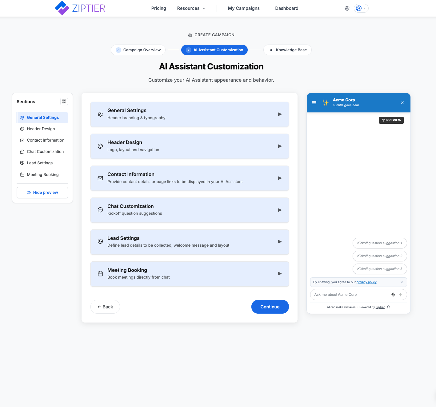
Customization happens at the campaign level, meaning each ZipTier campaign can have its own unique AI Assistant personality, appearance, and behavior. The live preview panel on the right follows whatever section you're editing - switching to the Launcher Design section shows the launcher, switching to Chat Customization or Lead Settings shows the chat window - so you can see each change take effect as you make it. Use its Chat / Launcher toggle to jump between the two.
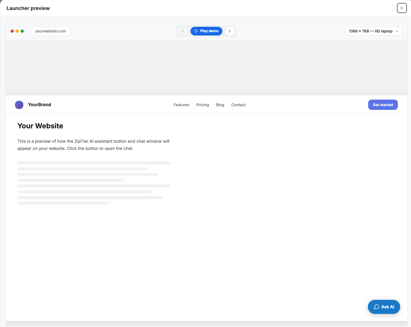
Click Expand in the preview panel to open it full-size over a mock website. From there, the resolution dropdown in the top-right lets you step through common Desktop, Tablet, and Phone sizes (or a borderless Focused view) to check how the launcher or chat window holds up at each one - without leaving the page or touching your embed code.
Below is the AI Assistant Customization screen, showing the collapsible sections panel next to the live chat and launcher preview.
1. General Settings
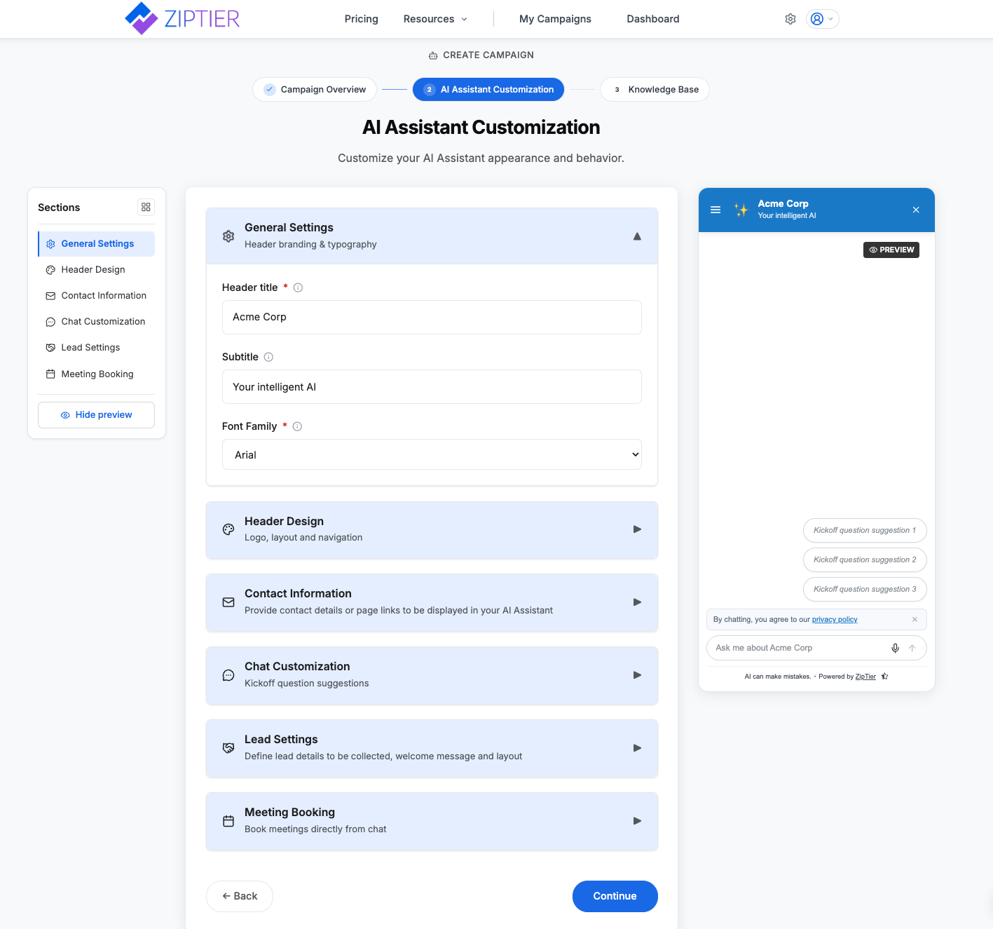
Title & Subtitle
- Sets context at the top of your AI Assistant
- Example:
- Title: "Broncor Americas Customer Summit 2025"
- Subtitle: "February 18–20, 2025 | Louisville, KY"
Typography (Font Selection)
- Available fonts: Inter, Roboto, Open Sans, Poppins, Lato, Nunito, Lexend, Arial, Helvetica Neue, Source Sans Pro, System UI, Georgia (serif), Merriweather (serif)
- Purpose: Match your brand's style guide
Below is the General Settings section expanded, with the header title, subtitle, and font family fields filled in.
2. Header Customization
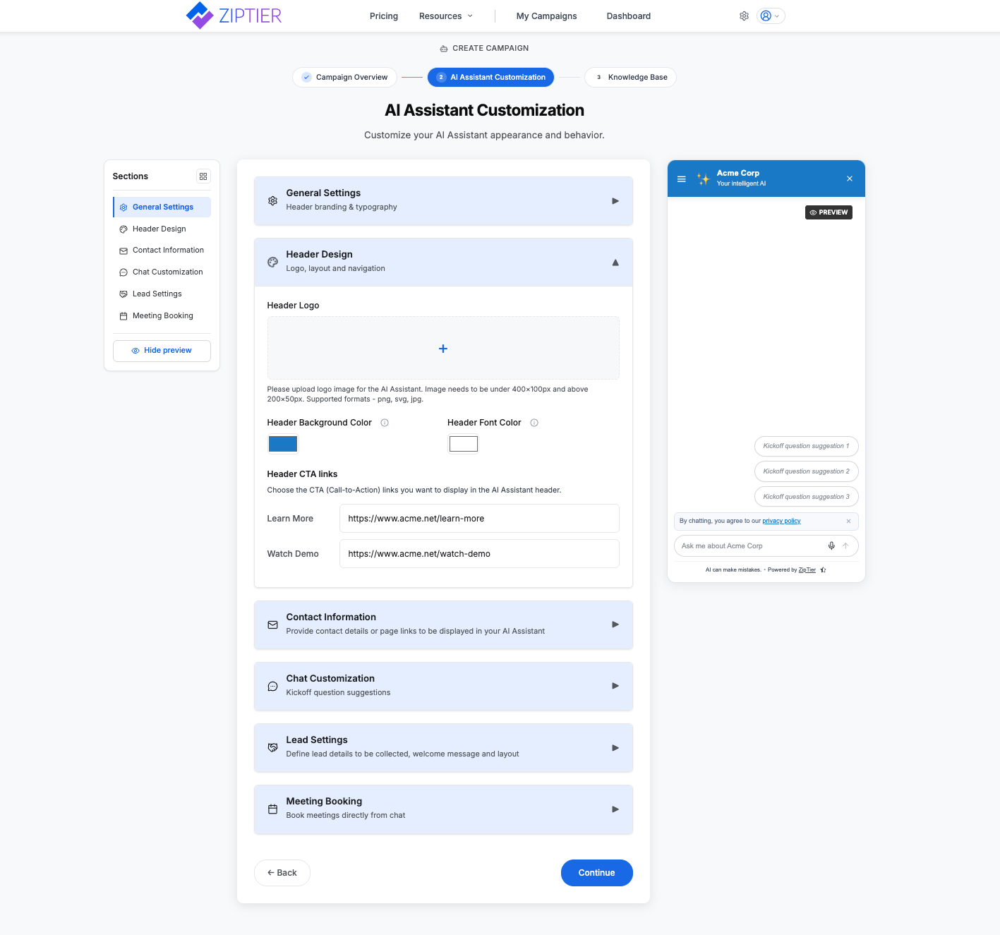
Header Logo
Upload a logo for your AI Assistant. Supported formats: PNG, SVG, JPG. Between 200x50px and 400x100px.
Header Background Color
- Background color for the AI Assistant header
- Default: blue
Header Font Color
- Color used for header text
- Default: white
Header CTA Links
Choose the CTA (Call-to-Action) links you want to display in the AI Assistant header. There are three:
- Learn More → e.g. https://example.com/learn-more
- Watch Demo → e.g. https://example.com/watch-demo
- Contact Us → not a single link - see below
Contact Us
Contact Us is the third header link, but instead of one URL it opens up a small contact page of its own: a page link plus a table of contact details so prospects can reach the right people directly from the AI Assistant. It's off by default - check the Contact Us box to reveal its fields.
- Contact Page URL (optional): link to your website's contact page, e.g. https://example.com/contact. If provided, a "Contacts Page" link appears at the top of the Contact Us dropdown in the AI Assistant.
- Contact Details: add entries for different purposes - each has a Purpose label (up to 50 characters), an Email Address, and a Phone Number. Prospects can open their default email client or copy/paste the email and phone number to reach out.
A few examples of contact entries you might set up:
- Registration: e.g., registration@example.com
- Logistics: e.g., logistics@example.com
- General Inquiries: e.g., support@example.com
- Add up to 10 entries with "+ Add Contact," and edit or remove any of them as needed
Unchecking Contact Us clears its fields - the page link and every entry - so leave it unchecked if you don't want a contact page at all.
Below is the Header Design section expanded, showing the logo upload, header colors, and the three Header CTA link options including Contact Us.
3. Launcher Design
Launcher Design controls the button visitors see on your site before the chat opens, and how it invites that first click. Saving these settings updates the widget on your website right away - your embed code never needs replacing.
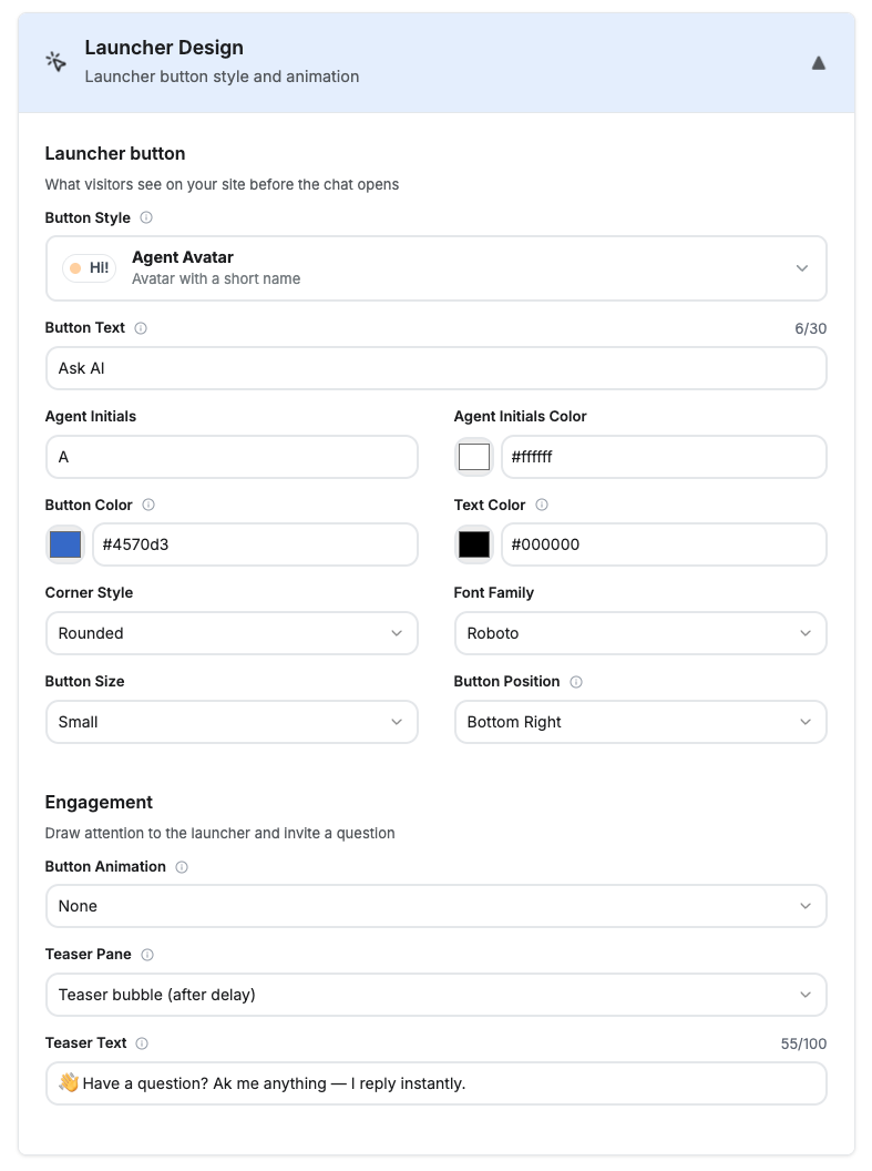
Below is the Launcher Design section expanded, showing the Agent Avatar button style fields and the Engagement settings below them.
For the full reference on every launcher button, animation, and teaser setting, see Launcher Design Reference.
Launcher Button
What visitors see on your site before the chat opens. Every style previews live on the right as you pick.
| Field | Options | Applies to |
|---|---|---|
| Button Style | Pill (icon with a text label) · Classic FAB (round icon-only button) · Agent Avatar (avatar with a short name) · Search Bar (ask-anything search box) | All |
| Button Text (Tooltip Text for FAB, Placeholder for Search Bar) | Up to 30 characters. Keep it short - this is the first thing a visitor reads. | All |
| Agent Initials | Up to 3 characters, defaulting to the first letter of Button Text | Agent Avatar, when Avatar Display is Initials |
| Agent Initials Color | Color picker | Agent Avatar, when Avatar Display is Initials |
| Button Color | Color picker - also tints the launcher's glow and icons | All |
| Text Color | Color picker - the label/icon color | All |
| Corner Style | Rounded · Sharp (rectangle) | Pill, Agent Avatar, Search Bar |
| Font Family | Inter · Roboto · Open Sans · Poppins · Lato · Nunito · Lexend · Arial · Helvetica Neue · Source Sans Pro · System UI · Georgia (serif) · Merriweather (serif) (the same list as the chat header) | Pill, Agent Avatar, Search Bar |
| Button Opacity | How transparent the bar looks over your page before a visitor focuses it | Search Bar |
| Button Size | Small · Medium · Large | Pill, Classic FAB, Agent Avatar |
| Button Position | Bottom Right · Bottom Center · Bottom Left | All |
Tip: Colors follow your header. Until you pick a button color of your own, the launcher tracks the header background and font colors you set in Header Design.
Animation and Teaser
How the button invites the first click. Button Animation and Teaser Pane are independent settings - both can run together, except for the avatar-based teaser, which replaces the button and so hides the Button Animation field.
| Field | Options | Notes |
|---|---|---|
| Button Animation | None · Jump on load · Attention pulse + badge | A one-time nudge on the launcher button itself, shortly after it appears. Search Bar only allows None and Jump on load - it has no badge to pulse. Hidden when Teaser Pane is Avatar-based teaser. |
| Teaser Pane | None · Bubble Text · Chat Snapshot · Avatar-based teaser | An engagement card that appears a few seconds after the launcher, inviting a question. Search Bar skips Chat Snapshot - there's no room for its miniature card. |
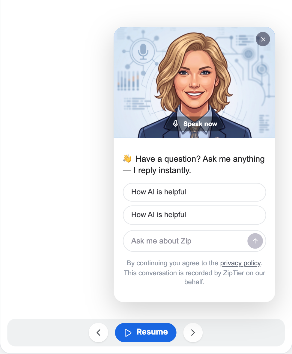
| Teaser Text | Up to 100 characters | Shown whenever Teaser Pane isn't None: in the bubble text, in the avatar-based teaser, and as the first message in the Chat Snapshot card. |
| Avatar Display | Avatar Image · Initials | Agent Avatar style only, whatever the Teaser Pane. Chooses whether the launcher button itself shows the Avatar image or the agent's initials - the avatar-based teaser card always shows the image regardless. |
| Avatar image | Pick from the avatar gallery | Shown for Agent Avatar with Avatar Display set to Avatar Image, and for any style with Teaser Pane set to Avatar-based teaser. Click the zoom icon on any image to preview it full-size before choosing. |
Below is the launcher preview with the avatar-based teaser active, showing the agent photo, teaser text, and quick-reply suggestions.
Below is the expanded preview over a mock website, with the resolution selector set to pick a device size.
Chat window size (how wide and tall the chat panel opens) is set from the Chat Customization section below, since it's about the chat panel rather than the launcher button - phones always open the chat full-screen regardless of this setting.
4. Chat Customization
Chat Window
- Width and Height sliders set how large the chat window opens (320–600px wide, 400–900px tall).
- Phones always open the chat full-screen, regardless of this setting.
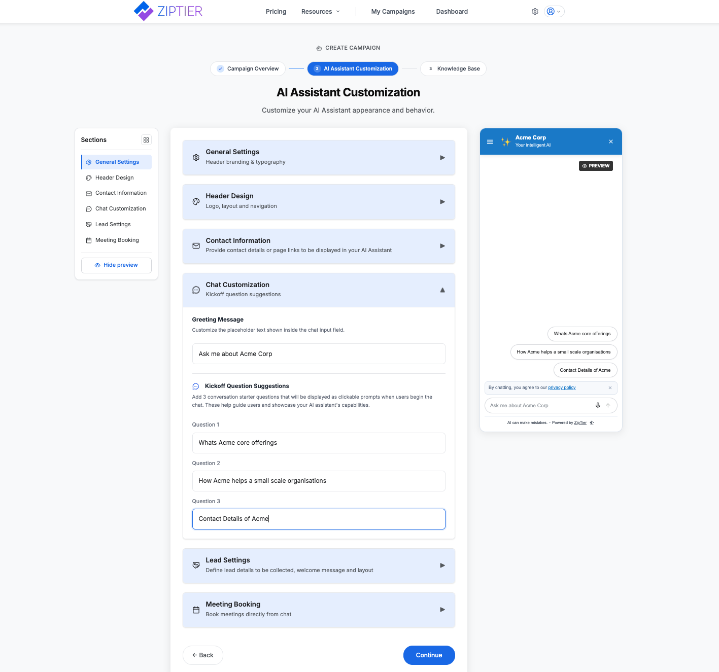
Chat Input Placeholder
- Placeholder text shown inside the chat input field (not a chat bubble)
- Limit: 40 characters
- Example: "Ask me about Widget X"
Kickoff Question Suggestions
Add 3 conversation starter questions, shown as clickable prompts when a visitor begins the chat. These help guide visitors and showcase your AI Assistant's capabilities.
- "Give me a quick summary of the summit agenda"
- "What are the unique features of Widget X?"
- "As a small retailer, what ROI can I expect?"
- Up to 60 characters each
Below is the Chat Customization section expanded, showing the chat window sizing sliders, input placeholder, and kickoff question fields.
5. Lead Settings
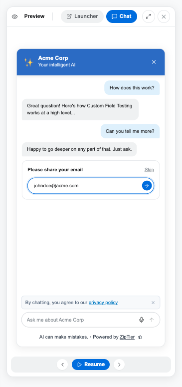
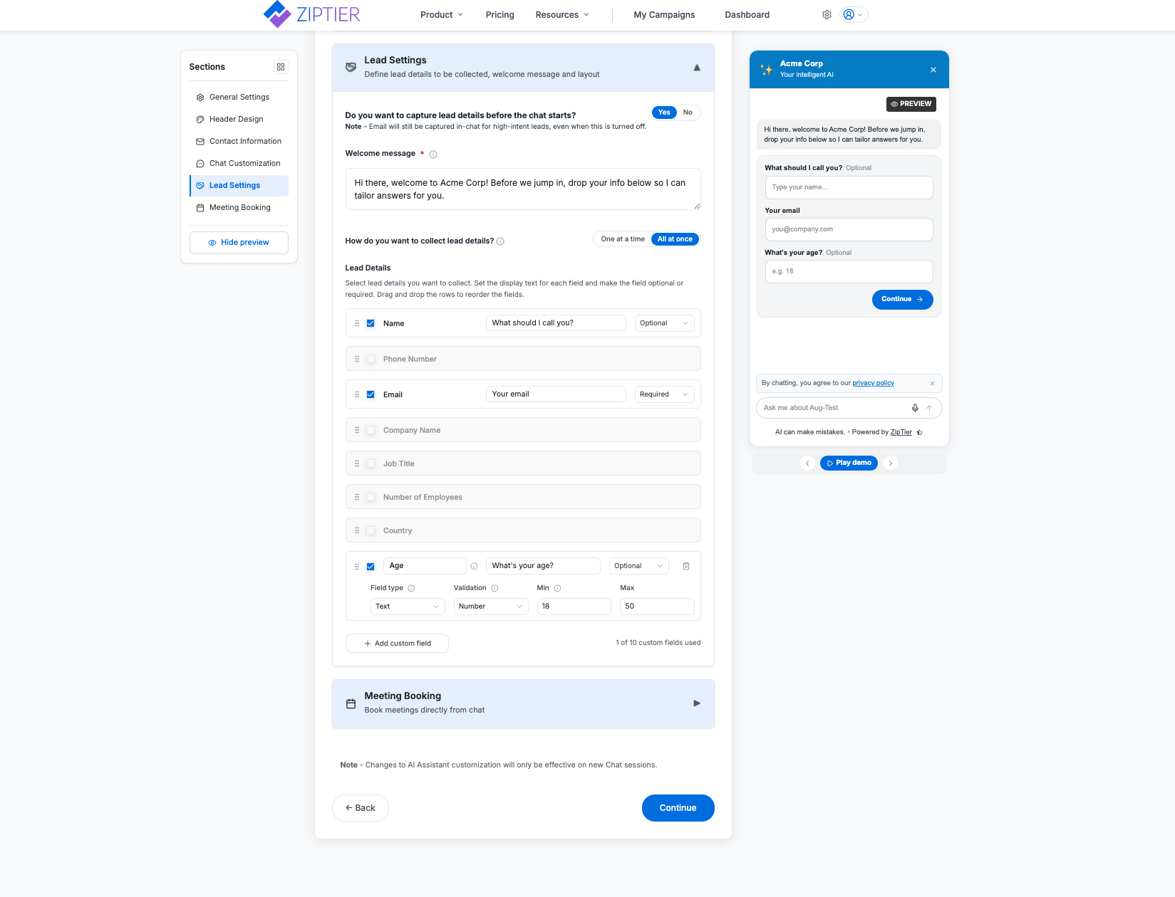
Lead capture settings for your AI Assistant: when questions are asked, which contact method is asked for first, and what else you ask on top of it.
Capture Mode
Choose one of three modes for when lead questions are asked:
- Before Chat: questions are asked up front, one at a time, before the visitor can start chatting.
- During Chat: the visitor starts chatting right away; questions are woven in after a couple of exchanges with the assistant.
- High Intent: nothing is asked until the visitor shows buying intent in the conversation, then the same questions are asked one at a time.
All three modes ask the same set of questions, one per card, in the same order; the mode only changes when that sequence begins.
Below is the chat preview mid-conversation, showing an inline lead question card asking the visitor for an email address.
Welcome Message
Only shown when Capture Mode is set to Before Chat: it's the assistant's first chat bubble, shown before any lead questions are asked. During Chat and High Intent skip it and open straight into the normal chat kickoff.
- Required when Capture Mode is Before Chat; not shown at all in the other two modes
- Limit: 300 characters
- Example: "Welcome to the Widget X experience center! I'm here to answer your questions and guide you through implementation options."
Primary Contact
Pick exactly one way to reach the visitor: Email or Phone, not both, not neither. Whichever you pick is always asked first, in every capture mode, with its own Mandatory/Optional setting and custom question text.
- Mandatory: Field is shown and required (marked with *)
- Optional: Field is shown but not required
Additional Fields
On top of the primary contact, you can enable up to 2 additional fields, so at most 3 questions are ever asked in total. Choose from:
- Name, Company Name, Job Title, Number of Employees, Country: each Mandatory / Optional
- The contact method you didn't pick as primary (e.g., if Email is primary, Phone becomes available here), collected like any other additional field, not as a second primary contact
- Custom fields you create (see below)
A live counter shows how many of the 2 slots are in use. Once both are filled, enabling another field requires disabling one first. Drag any enabled field into any order relative to the others.
Tip: With only 3 questions ever asked (primary contact + 2 additional), pick fields you'll actually use. For top-of-funnel campaigns, consider making most of them optional.
Custom Fields
Need to ask for something beyond the fields above? Click + Add custom field to create your own Text or Dropdown question. Custom fields share the same 2-slot additional-fields cap described above; they don't add extra room on top of it.
- Text example: "Age": a text field with number validation, restricted to a 18–50 range
- Dropdown example: "How did you hear about us?": with choices Search Engine, Referral, Social Media, Event
Below is the Lead Settings section expanded, showing the capture mode, welcome message, primary contact, and additional fields list.
6. Lead Scoring
Every lead captured by this campaign is graded High, Medium or Low. This section is where you decide what those grades mean: how much the visitor's profile counts against the intent detected in the conversation, what each answer is worth, and where the cutoffs sit.
It sits directly below Lead Settings because it can only score the fields you collect there.
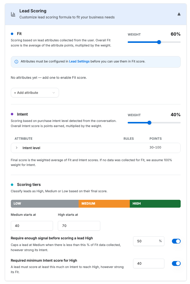
Fit and Intent
- Fit: who the visitor is, scored from the answers they gave to your lead questions.
- Intent: how ready they are to buy, detected from the conversation as High, Medium or Low.
- The two share 100% of the score, so raising one group's weight slider lowers the other.
Attributes & Rules
Add a collected field to the Fit group and write rules that price its answers 0–100. For example, a company email domain scores 100 while a personal one scores 30. Rules run top to bottom and the last one that matches wins.
Scoring Tiers
Set where Medium starts at and High starts at. The bar above the two boxes shows how much of the 0–100 range each grade covers.
Guardrails (Optional)
Two ceilings that can cap a lead at Medium: a minimum Intent score required for High, and a minimum share of your scoring that had to have data. Both ship off.
Below is the Lead Scoring section, showing the Fit and Intent weight sliders, the Intent level rules, the Scoring Tiers bar, and the Guardrails toggles.
You can skip this section. Every campaign starts on a default that grades leads purely on detected intent, exactly as ZipTier has always done. Nothing changes until you change it.
For the full picture (how Fit and Intent combine, the rule builder, guardrails, and worked examples), see Lead Scoring.
7. Meeting Booking
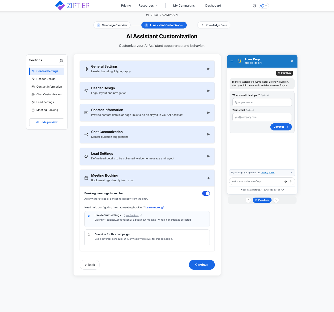
Toggle whether visitors can book a meeting directly from chat, and choose whether this campaign uses your global scheduler defaults or a scheduler override just for this campaign.
Below is the Meeting Booking section expanded, showing the booking toggle and the choice between default scheduler settings and an override.
For the full picture (scheduler setup, prefill behavior, and what visitors experience in chat), see In-chat Meeting Booking.
← Step 1: Campaign Overview | Next: Step 3: Campaign Knowledge Base →