Widget Customization Reference
This is the full reference for the ZipTier embed widget's optional attributes. Every attribute below is optional — omit any to use the default. For the basic install and required attributes, see the Website Embed guide.
Button Style & Appearance
| Attribute | Default | Description | Values |
|---|---|---|---|
data-button-style | pill | Visual style of the launcher button | pill, fab, avatar, textbox |
data-button-text | Ask AI | Label on pill/avatar, placeholder on textbox, tooltip on FAB | Any string, e.g. Get Help |
data-button-color | #4F46E5 | Background color of the button | Hex color, e.g. #667eea |
data-button-text-color | #ffffff | Text / icon color on the button | Hex color, e.g. #000000 |
data-button-size | medium | Size of the launcher button | small, medium, large |
data-button-font | System font stack | Font family for button text | Inter, Roboto, Poppins, etc. |
data-button-corner | rounded | Corner style for pill, avatar, and textbox launchers | rounded, sharp |
data-button-animation | bounce | Engagement animation played when the button first appears | none, bounce, pulse, teaser, auto-open |
data-greeting-text | 👋 Have a question? Ask me anything — I reply instantly. | Message shown in the teaser bubble, or as the opening AI message when the chat auto-opens. Only used when data-button-animation is teaser or auto-open. | Any string |
Launcher Button Styles
| Style | Description | Best for |
|---|---|---|
pill | Rounded button with chat icon and label text (default) | Most websites — visible and descriptive |
fab | Round floating action button with chat icon only, no label | Minimal footprint; the icon is universally recognized |
avatar | White card with an agent avatar circle and name — conveys a human presence | High-touch sales or support experiences |
textbox | Search-bar style with a text input. Users can type a question before opening the chat; the message is auto-sent as the first message. | Product pages where users arrive with a specific question |
Style Previews
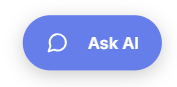
Pill — rounded button with a chat icon and label text. The default; the widest option and the most self-explanatory.
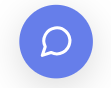
FAB — a floating action button showing only the chat icon. The smallest launcher; use it when you want the assistant present but visually quiet.
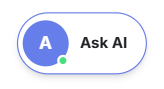
Avatar — a white card with an agent avatar circle and name label. Signals a human-like presence and reads as more high-touch than a plain button.
Textbox — a search-bar shaped input with a placeholder. Visitors can type their question directly; the message is auto-sent as the opening line when the chat opens.

Avatar Style (data-button-style="avatar" only)
| Attribute | Default | Description |
|---|---|---|
data-button-avtr-initials | First letter of button text | Initials shown inside the avatar circle (up to 3 characters) |
data-button-avtr-initials-color | #ffffff | Color of the initials text inside the avatar circle |
Search-Bar Style (data-button-style="textbox" only)
| Attribute | Default | Description | Values |
|---|---|---|---|
data-button-opacity | 0.4 | Background opacity of the search-bar launcher | 0.4–1 |
Note: the pulse and auto-open animations aren't available for the textbox style — use bounce, teaser, or none instead. On mobile viewports, auto-open automatically falls back to bounce to preserve screen space.
Button Position & Widget Size
| Attribute | Default | Description | Values |
|---|---|---|---|
data-button-position | bottom-right | Fixed position of the launcher button on screen | bottom-right, bottom-left, bottom-center |
data-widget-width | 400px | Width of the chat widget panel | 400px–600px |
data-widget-height | 800px | Height of the chat widget panel | 400px–800px |
Complete Customization Example
<script
  src="https://chat.ziptier.ai/wgt/script/latest.js"
  data-chat-url="https://chat.ziptier.ai/bt/v1?id=1234567890"
  data-button-style="pill"
  data-button-text="Ask AI"
  data-button-color="#667eea"
  data-button-text-color="#ffffff"
  data-button-size="large"
  data-button-font="Inter"
  data-button-corner="rounded"
  data-button-position="bottom-right"
  data-widget-width="400px"
  data-widget-height="800px"
></script>
Ready-to-Use Examples
Search-bar launcher with pre-filled message:
<script
  src="https://chat.ziptier.ai/wgt/script/latest.js"
  data-chat-url="https://chat.ziptier.ai/bt/v1?id=1234567890"
  data-button-style="textbox"
  data-button-text="What would you like to know?"
></script>
Agent avatar launcher:
<script
  src="https://chat.ziptier.ai/wgt/script/latest.js"
  data-chat-url="https://chat.ziptier.ai/bt/v1?id=1234567890"
  data-button-style="avatar"
  data-button-text="Ask Alex"
  data-button-avtr-initials="AL"
  data-button-color="#667eea"
></script>
Custom button text for a product page:
<script
  src="https://chat.ziptier.ai/wgt/script/latest.js"
  data-chat-url="https://chat.ziptier.ai/bt/v1?id=1234567890"
  data-button-text="Ask Our AI About This Product"
></script>
Left-side positioning with bounce animation:
<script
  src="https://chat.ziptier.ai/wgt/script/latest.js"
  data-chat-url="https://chat.ziptier.ai/bt/v1?id=1234567890"
  data-button-position="bottom-left"
  data-button-animation="bounce"
></script>
Teaser bubble with a custom greeting:
<script
  src="https://chat.ziptier.ai/wgt/script/latest.js"
  data-chat-url="https://chat.ziptier.ai/bt/v1?id=1234567890"
  data-button-animation="teaser"
  data-greeting-text="Questions about pricing? Ask me anything."
></script>
Auto-open the chat with a greeting after visitors arrive:
<script
  src="https://chat.ziptier.ai/wgt/script/latest.js"
  data-chat-url="https://chat.ziptier.ai/bt/v1?id=1234567890"
  data-button-animation="auto-open"
  data-greeting-text="Hi there! Ask me anything about this page."
></script>
Translucent search-bar launcher:
<script
  src="https://chat.ziptier.ai/wgt/script/latest.js"
  data-chat-url="https://chat.ziptier.ai/bt/v1?id=1234567890"
  data-button-style="textbox"
  data-button-opacity="0.6"
></script>
Prefer a visual, no-code way to configure all of the above? Use the Widget Builder Playground — every attribute on this page maps to a form control, with a live device preview and one-click copy of the generated embed code.